

GrapeOla Packaging Design
GrapeOla Packaging Design
This premium 100% grape seed oil from Spain now boasts a refined and sophisticated appearance that truly reflects its quality. Straying from the typical "obvious" grape-themed branding, the new designs with striking botanical illustrations and modern typography effectively showcases the oil's natural goodness. Key features such as its non-GMO certification, cholesterol, and preservative-free attributes are clearly highlighted, enhancing GrapeOla’s shelf appeal and reinforcing its position as a versatile choice for health-conscious cooks.
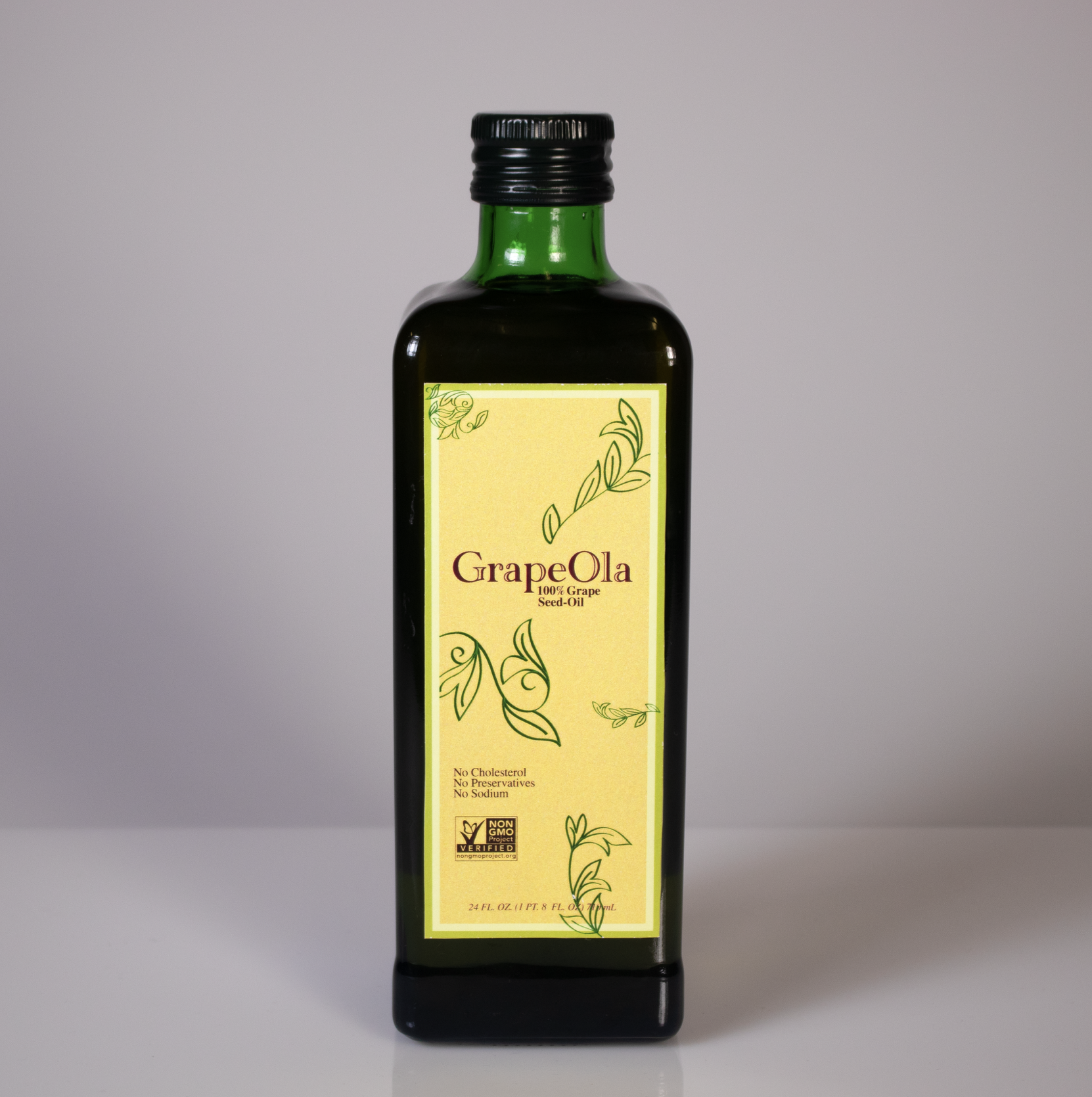


The color palette retains GrapeOla's brand identity by incorporating similar earthy tones, ensuring continuity and familiarity for loyal consumers. This refined palette enhances the design’s elegance, creating a balance between modern sophistication and brand consistency.
-
![]()
Before
-
![]()
In-Store Before
-
![]()
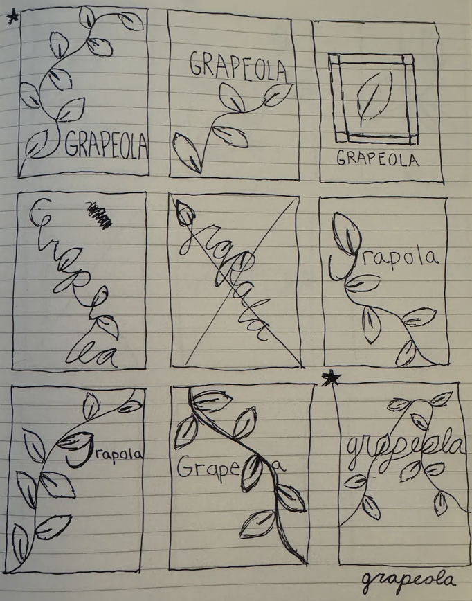
Initial Sketches
-
![]()
Initial Sketches


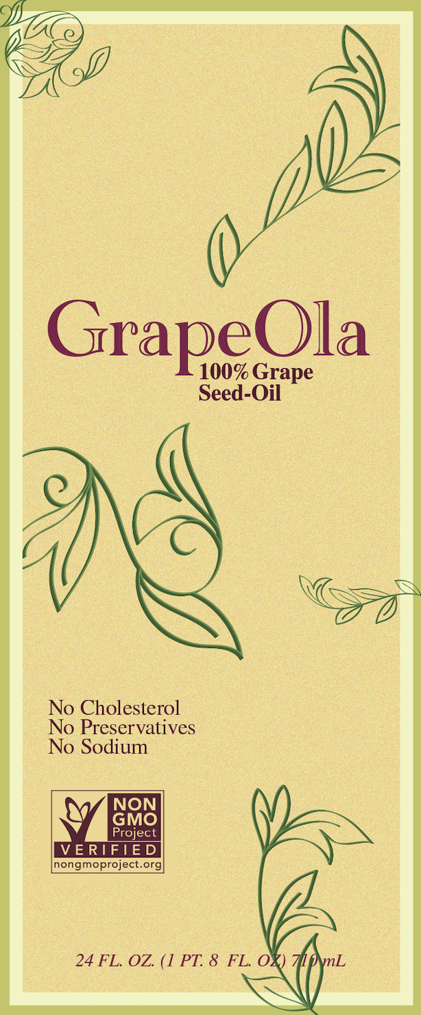

For the typography of "GrapeOla," the logo uses a custom version of Academy Engraved LET to create an elegant typeface, emphasizing the luxurious and timeless nature of GrapeOla.
For the supporting typeface, STIXGeneral provides a complementary balance with its classical serif structure, connecting tradition and modernity in its branding.