
GREATER CLEVELAND FOOD BANK WEB DESIGN
GREATER CLEVELAND FOOD BANK WEB DESIGN
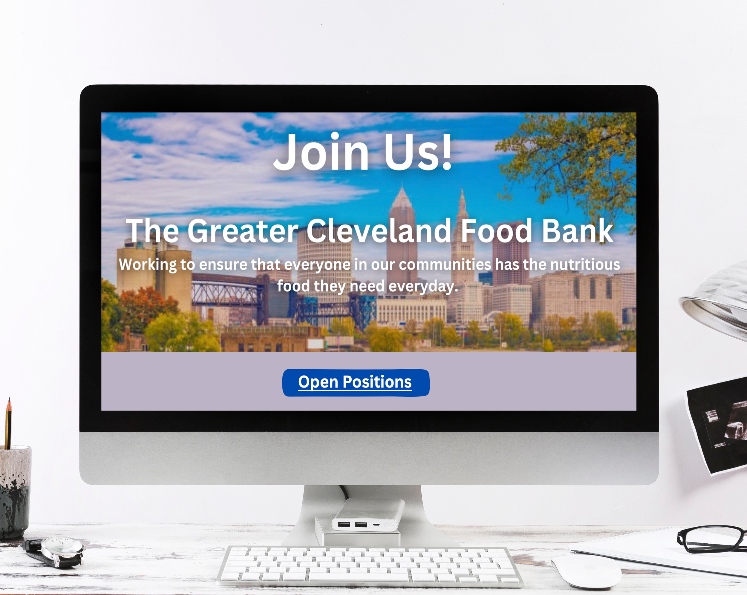
The redesigned website for The Greater Cleveland Food Bank now presents a modern, engaging, and visually dynamic experience that reflects the organization’s mission and culture. With a refined layout, cohesive color scheme, and impactful imagery, the new design highlights the Food Bank’s DEI initiatives, company culture, and community engagement efforts. Key features include an interactive events section, employee testimonials, and leadership headshots, all aimed at attracting diverse applicants. Thoughtful visual elements, such as curated graphics and photos from past events, enhance the site’s appeal while reinforcing the Food Bank’s commitment to inclusivity and outreach.
The color palette preserves The Greater Cleveland Food Bank’s brand identity by integrating its signature blue and green, maintaining visual continuity. This refined selection enhances the design’s elegance, seamlessly blending contemporary aesthetics with brand authenticity.
-
![]()
Home Page
-
![]()
Who Are We?
-
![]()
DEI
-
![]()
Company Culture
-
![]()
Hear From Our Employees
-
![]()
Benefits & Perks
-
![]()
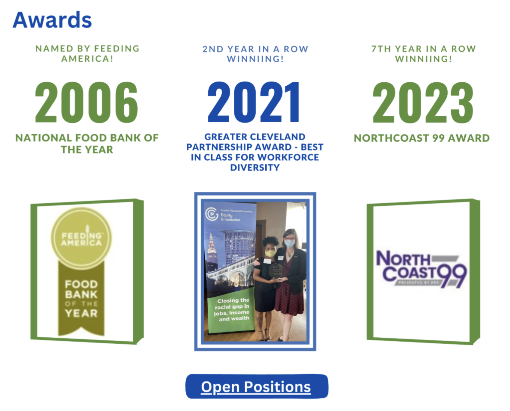
Awards
-
![]()
Join Us


For the typography of The Greater Cleveland Food Bank’s website, a clean and modern sans-serif typeface was chosen to align with the organization’s preference for simplicity and clarity. This choice enhances readability while maintaining a contemporary, approachable feel. The streamlined design reflects the Food Bank’s commitment to accessibility and inclusivity, ensuring a user-friendly experience that remains true to the brand’s vision.